Ruan van der Sande

Who?

It took me a bit of research to find some sort of bio on the talented Ruan van der Sande. Eventually I came across an interview he did for Talented Minds back in 2011. In there I found out that Ruan was born and raised in South-Africa, Johannesburg (I thought he came from the Netherlands, based on his Dutch-sounding name). He moved to London in 2003 and up until then had never been in contact with photography or cameras. He worked as an IT'er in your typical office setting, nothing glamorous about that (trust me, I know ;-). The trigger was when he bought a point-and-shoot for a Switzerland trip in 2006. He found his true passion for photography and by 2007 the first DSLR was a fact. If we fast forward to 2014, Ruan has more than 20K followers on Instagram and he now works full time on the coolest shoots (involving gorgeous models). His work is mostly a mix of beautiful people, sexy vibe and class!

The Picture

I chose this picture because it exemplifies Ruan's style. It was posted recently on his Instagram account and as an added bonus, it introduces the viewers to the beautiful young German model, Lorena.   

Lorena by rvds on instagram

Lorena by rvds on instagram

Composition

Cropping wise, Ruan broke the standard rules by cutting off the left hand of the model at the wrist and the legs at the shins. Hereunder you can find a cropping guide for photographers when shooting portraits. The red lines indicate the places on the body where a crop looks akward. The green lines point out the places where a crop is visually pleasing. But as we all know, every rule has exceptions to it. Not including the left hand leaves room for imagination and curiosity. Is she holding a glass or is it just hanging over the edge of the chair? If a photographer makes a creative decision by changing the crop and the overall result is good, no one will complain. 

When you look at posture and the way the model is placed within the frame, you can notice some interesting lines. The first is the subtle head tilt, which creates a parallel line with the shoulders (left shoulder up and right shoulder down). This adds some dynamic to the picture. Making your model cross her legs also gives an interesting visual effect. It has a slimming effect and raises one hip higher than the other. This is particularly useful when your subject is sitting down and you want to use a relatively wide angle lens (distortion will make foreground elements appear larger). 

Colour combination

For this picture, Ruan used a powerful colour combination of red, black and white (together with flawless skin tones). To me, this colour combo was made famous by Michael Jordan, when he was playing for the Chicago Bulls. Some of the best sneakers designs were amplified by  the clever use of colours. A prime example of this is the iconic Air Jordan 11.

Air Jordan 11

In the photograph, the black velvet cover chair can be interpreted as a sign of sophistication and mystery. It also adds some nice contrast to the model's skin. The blown white background is the yang to the chair's yin and adds balance to the picture. It creates the ultimate in contrast and makes sure all the viewer's attention goes to the model and the chair. White can hold meaning of purity and simplicity, which suits the image well. The red dress adds a splash of colour to the entire frame and gives the model a flair of danger and passion. Combining all these components adds up to a compelling image that will make you look twice.

Roadtrip Norway: the portrait series

During our 4 weeks road tripping in Norway, I found a couple of moments to capture a few environmental portraits of my love, friend and travel companion. You can have a look at them in the gallery below. They were all captured in natural light, so no added strobes or reflectors, only wysiwyg images :-).


Tim Tadder

Who?

Tim Tadder started out as a photojournalist for a couple of newspapers and then evolved into a commercial and editorial photographer. He is known for his unique portraits and powerful sports images. Currently he lives and operates from the beautiful small town Encinitas (San Diego area) in Southern California.

On a side note, I read he holds 2 degrees, a BS in Mathematics and a MA in Visual Communication. This confirms one of the views I have on (digital) photography. A great photographer should have or find a balance between the left and right side of his/her brain. The technical aspect of photography can not be ignored (shutter speed, flash exposure, file storage, settings, websites, sensor size, lenses, physics of light, ...) and they require a big part of your analytical 'left' brain. The creative part of photography is what separates you from the masses and allows you to create your own distinct vision and style. This is where the right imaginative 'right' brain proves its value.

The picture

Tim Tadder - water wigs

Concept

According to an interview he did on this project, titled 'Water Wigs', Tim grew tired of doing the same thing when it came to making portraits. One of the benefits of doing high paid commercial and editorial work is that you sometimes have the time and financial means to try something new and creative. So he came up with the crazy idea of letting water balloons, filled with water, explode on the heads of bald models. By doing this, the goal was to create the illusion of hair of headwear (hat, scarf, ...). Cool concept when you read it like that, but how do you do it?

Technique

If you want to freeze action, you enter the world of high speed photography. There are a couple of ways of doing this and it depends on the equipment and look you are after. In this particular case Tim chose to do the following:

  • Use a completely dark room, meaning absolutely no ambient light, when taking the actual pictures.
  • Set the camera to bulb mode so that the sensor would only register the flash exposure. Bulb opens up the shutter and lets you choose when to close it again. As long as the flash exposure happens within this timeframe, the image is captured and you do not have to worry about shutter delay (synching the shutter with the exact moment the flash fires).  
  • Use a low power setting for the flashgun(s), so that the flash duration is as short as possible. He needed 1/10.000 of a second to freeze the moment of the water balloons exploding.
  • Use color gels on the flash heads to add the vibrant colors in the photo.
  • Use a flash trigger to capture the exact moment of explosion. Tim first used a laser trigger, aimed at the head of the model. When the balloon hit the laser, the flash gun was triggered. We are talking about milliseconds here and it resulted in unreliable final results. Sometimes the flash would fire while the balloon was still wrapping the head and before it actually exploded. To fix this problem, he switched to an audio trigger that would react to the sound of the balloon exploding. To be sure the sound was loud enough, he amplified it by strategically placing a microphone on the set. 
  • Trial and error. This type of experimental photography is an adventure for both the photographer and the model. Although the models were the ones that got soaking wet on a consistent basis :-).

Behind the scenes video

Tim Walker

A lot of photographers try to capture moments around them. While pursuing this goal, they often aim at reproducing the scene to perfection in a digital file or an analogue film frame. A still image that can tell a story and has a high documentary value.
And there are others, primarily in the fashion business, that try to create unseen, out-of-this-world images or visions. The concepts are created in the right side of their brain and know no boundaries or limitations. Creativity is not optional in this line of work, it's mandatory.

Who?

T. Walker is a London based fashion photographer that exemplifies the latter group. Early in his career he worked as an assistant for Richard Avedon, a photography legend in his own right. Later on, Tim quickly made a name for himself and became famous for his Vogue covers. His images can be tagged with the keywords: fairy tale, romantic, extravagant & ethereal. They grab your attention and you get the feeling that you're peeking into a hidden world, a fairy tale. Discover more of his work here.

The Picture

A fairy tale, by Timothy Walker

A fairy tale, by Timothy Walker

I chose this particular image because to me it captures the fairy tale story feel as if it was directed by the Brothers Grimm themselves. The delicate gesture and positioning of the model's arm, the larger than life dress, the spiral staircase, the magnificent muted colours and tones... It results in an a-typical interpretation of a Rapunzel like tale where a princess is trapped in a tower, letting her gown hang out to draw attention. Styling wise, this entire image is impeccable. The tone of the dress, the girl's hair color, the walls, the floor, the door, the staircase, ... it's flawless and still it feels effortless in some way. As if she just lives there and Tim Walker just happened to be there and capture the moment. Everything about the composition is larger than life, which makes it that more compelling.  

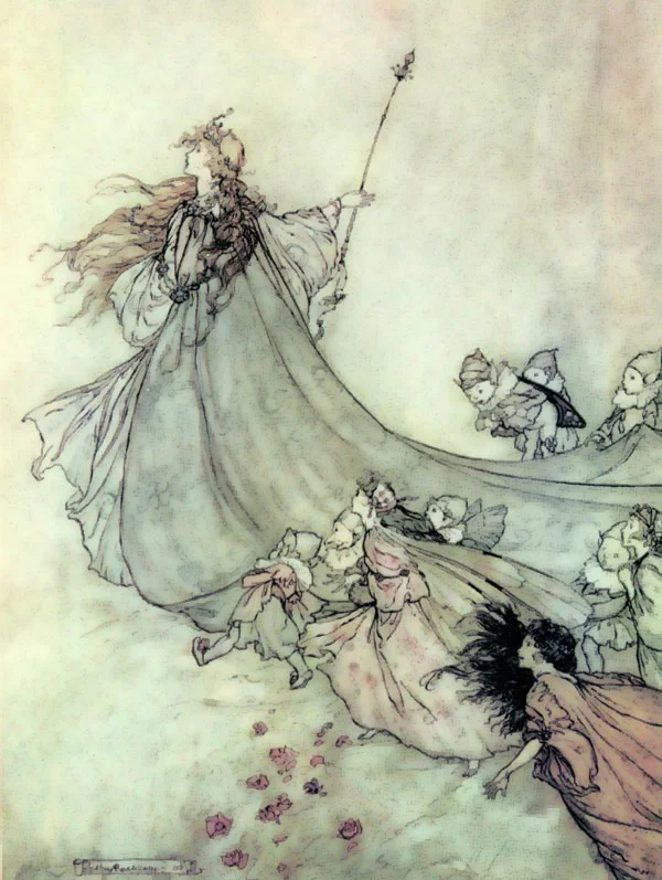
In an interview he did, Tim referenced an illustrator by the name of Arthur Rackham. I Googled him and shortly discovered that he indeed could be a source of inspiration for his work. Check out the illustrations hereunder that blend nicely with the photograph.

Technically this picture lives of the large window light that is coming in from the left side of the frame. It gives a beautiful soft light that complements the location. Speaking of the location, how cool is that! Based on the short description that comes with the photograph, it is a place somewhere in India anno 2005. I do not know which location scout found this place, but he/she was spot on with this one. Who wouldn't like to shoot in an environment like that!

Award of excellence

I recently joined a photography competition website, called I Shot It.  It's a great way to explore new things and be inspired, because they have a lot of contests open at any time on various subjects. The images range from amateur to professional, which makes it that much more interesting and accessible. Keep in mind though that you have to pay a fee for each photograph that you submit. That's a good thing, because it makes you think twice during the selection process, thus improving the overall quality. The winner of each contest gets recognition, a money prize and most of the time some great Leica gear.

Today I am glad to report that one of my images received an award of excellence. Unfortunately I did not win 1st prize, but the recognition is quite a motivator in its own right. Be sure to check out the winning picture by clicking the badge!


The beauty of window light

Do you sometimes envy famous photographers for their great lighting equipment? Imagine all the great things you would be able to produce when working with gigantic softboxes or a brand new Broncolor 330 Para Umbrella. 

Image courtesy of Eric Raptosh

Image courtesy of Eric Raptosh

What if I told you that you can probably find a light source that is just as big, or sometimes even bigger and that gives ample soft wrapping light. The only thing you have to do is look around your city, neighborhood or home (if you're living large) and go find a nice big window. Yes, that's right, the glass shapes that you can find in almost every wall :-). 

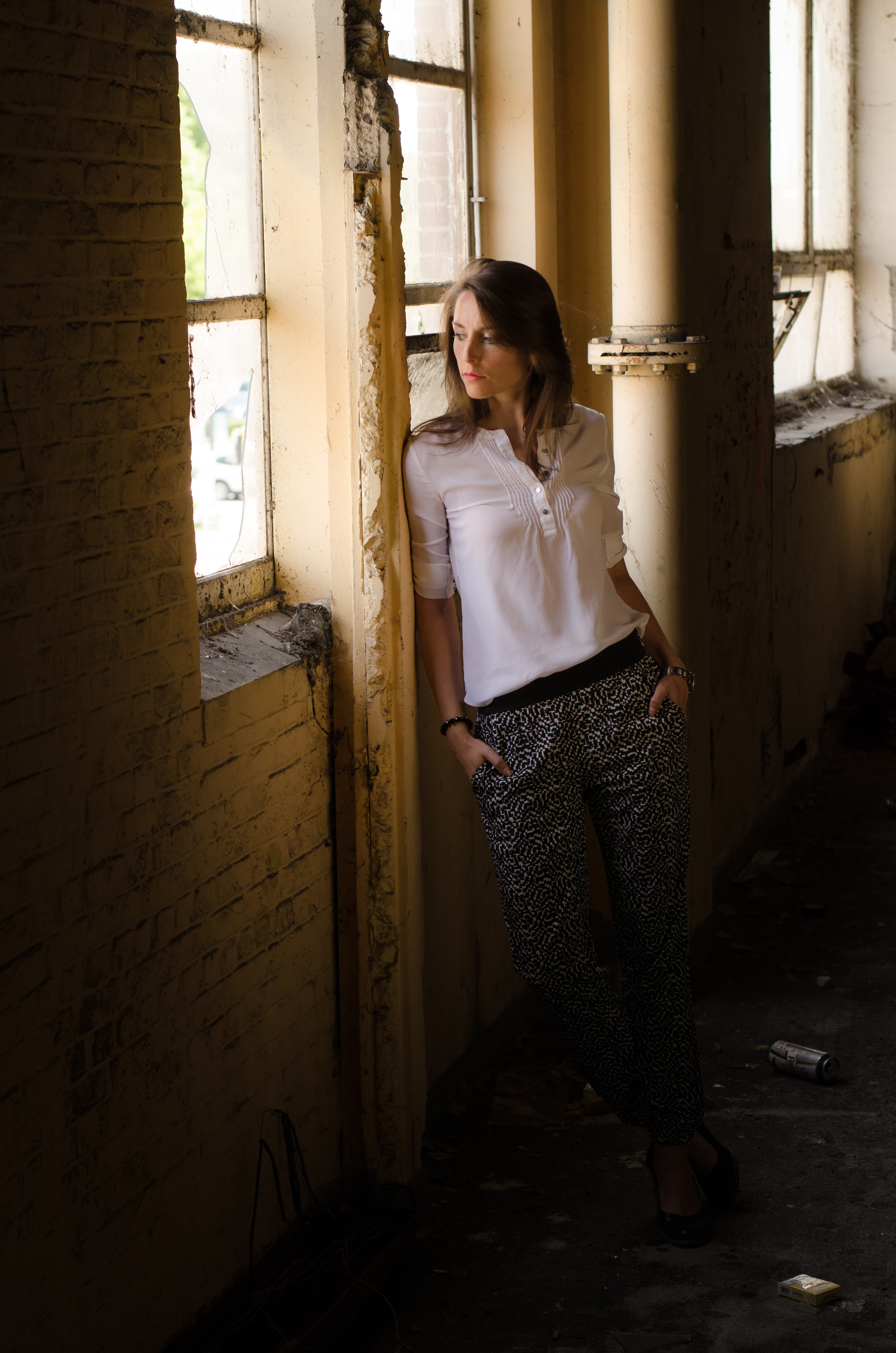
Relatively ugly looking on the outside, but nice soft light on the inside.

Relatively ugly looking on the outside, but nice soft light on the inside.

Last Sunday, I set out to capture a few shots in this building (a parking lot actually, quite deserted at that time). The lighting setup was quite straightforward here. I used the large window as my main light, angled from the side on my model. Occasionally I used a reflector to even out the shadows on her face, but in general I liked the mood the shadows created. I put my camera in Manual mode and underexposed the image 1 or 2 stops to get the more dramatic look I was after. All in all we spend like 45 minutes here and the experiment was a wrap. Hope you like them!

Kyle Alexander

Who?

According to the bio on his website, Kyle Alexander is a freelance photographer/director, born in Texas, moved to Hawaii to shoot surfing and then re-located to the LA area. There is a very interesting link to an interview he did with the people at aPhotoEditor, so be sure to check that out!

If I would have to describe his style in 3 words, then I'd settle on Genuine, Sun-kissed & Moments. If you go through his portfolio books, you instantly get a warm feeling. His pictures do not have the technically perfect 'Photoshop' label written all over them. Instead they have a high documentary value to them, moments in time captured by a talented eye. Genuine moments with real people, captured in gorgeous light (mostly setting or rising sun feel) conditions.

Check out his portfolio here.

The picture

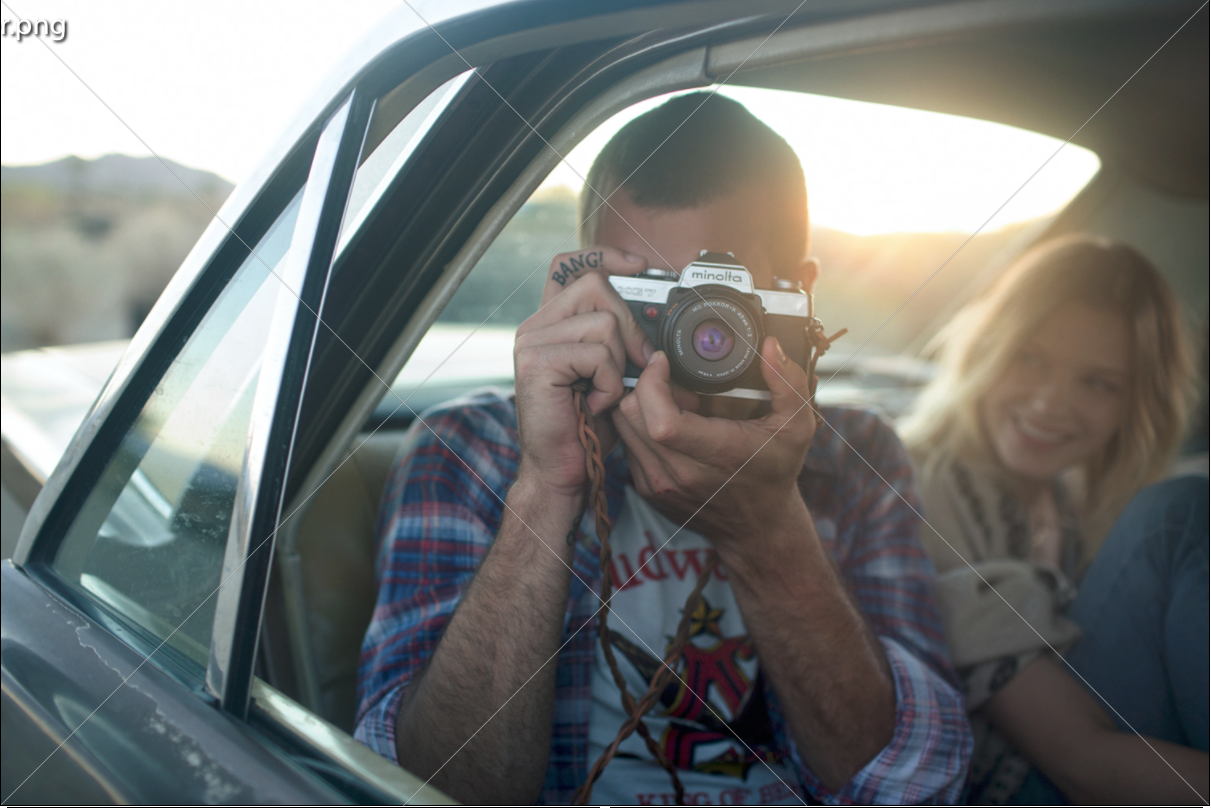
Click Click Bang

Click Click Bang

Mood

This photograph just oozes Good Vibrations, as if the Beach Boys wrote their song inside the same car. The people in the car look genuinely happy and content. The story that I like to build around this photo is a group of friends going on a road trip in a vintage car with no specific destination in mind. They go with the flow, see where the road will bring them. A summer festival, surf spot, campfire, ... are other ingredients that work well within this story. Every time a photograph inspires you to daydream and build your own story, it has reached one of its goals.

Lighting

The sun is the prominent light source in this picture and it's clearly visible in the frame, as the blown highlight in the rear window. If there is no use of reflectors or extra lights, it's either exposing for your subject (resulting in the 'hot' highlight) or the background (resulting in a silhouette picture).

Most photography books will teach you to avoid blowing out highlights. There a lot of ways to do this: balance fore- and background by using (strobe) lights or reflectors; use graduated ND filters; make sure that the dominant light source is not in the frame ... This picture proves that all rules can be broken and that it can result in a very compelling image.

Composition and details

Most people tend to place their subject in the center of the frame, generally resulting in a 'boring' image. One of the major techniques for making images instantly more compelling, is using the "rule of thirds", a concept known to every photographer, amateur and pro alike. The rule proposes that an image should be imagined as divided into nine equal parts by two equally spaced horizontal lines and two equally spaced vertical lines, and that important compositional elements should be placed along these lines or their intersections. In other words you divide a picture in 9 equal squares and you put the the main focus/message on the intersections of the outside lines.

kyle-alexander-rule-of-thirds

 Now we all love to break the rules now and again, especially if they are used a lot. The man, who is taking a photo (of the photographer in this case), is placed in the middle of the frame and nothing is really happening on the exact intersections of these grid lines. Nevertheless I find this image compelling, thanks to the details, color, mood... and maybe also composition.

The rule of thirds is not the only theory about composition that is out there. I tried the one about the Diagonal Method (DM) on this image and the result is quite interesting. The technical explanation for the DM is simple: a typical 35mm picture is a rectangle (landscape orientation) with a ratio of 2:3, which allows you to draw 2 overlapping identical squares on top of it. You then draw 2 diagonal lines (corner-to-corner) in each square, resulting in 4 intersecting lines. Extensive research has shown that several famous classical painters have placed important parts (eyes, objects, gestures) of their paintings right on these diagonal lines.

kyle-alexander-diagonal-method

As you can see in the picture with the diagonal overlay (which you can select in Lightroom in the cropping tool), there is a nice observation to make. The diagonal line that starts from the bottom right corner intersects perfectly with the camera he's holding and if you would be able to see the subject's eye, it would run over it as well. The viewers attention is drawn to the camera, as was intended by the photographer (I hope :-)). 

To finish, something completely different, but easily one of my favourite parts of this image, is the tattoo detail on the trigger finger. It is not perfectly in line with a diagonal line (close enough though), but compelling none the less. It is sure to put a smile on quite a few people (me included) and that is a great thing in its own right.

BANG!

Sandro Bäbler

Who?

After I read the bio on his website, I immediately knew that this young Swiss photographer would be one to follow more closely. He is an autodidact and decided to become a pro photographer after an intense few months traveling around the world.

It was via a Broncolor tweet that I discovered his work. He did some personal work in South Africa, in between client work, and the picture that was included caught my eye. 

Check out his portfolio for yourself here.

The picture

An unconventional beauty shot

An unconventional beauty shot

Mood

I just love the atmosphere this picture has. The flow of the hair just adds incredible dynamic, which is enhanced by the choice of a monochrome palette (color would not work for this shot, or at least not as good as B/W). 

Lighting

The primary light source comes most definitely from the right side/high angle of the subject. You can spot the drop-off in light on her right shoulder quite clearly. Also the shadow under her chin in easily noticeable and to my taste emphasizes the jawline quite nicely. Another tonal observation is the darker area close to her head, which gradually gets brighter to the edge of the frame (the ends of her hair). 

Composition

The hair makes up the majority of the frame and because her face is not visible, it also serves as the main focus point. I also like the fact that the hair acts as a leading line within the picture. The eye of the viewer gets drawn from the edge of the frame towards the center. You then get swept to the other side of the frame, because she is looking away from the camera. This dynamic that guides the eye edge-to-edge of the frame makes it particularly compelling to look at.

Get inspired!

Learn from the best

Over the last few months I have discovered a lot of talented photographers through various sources. I always find myself looking at their portfolios and admiring the work they have produced. After the awe-struck moment, rationality sets in and the image becomes the subject of analysis from different angles (lighting, mood, focus, composition, storytelling, ...).

Because I do not want to lose these educational moments, I decided to write them down in blog posts. In some cases I will also try to create an image of my own, inspired by the photo at hand. All comments and/or tips are greatly appreciated, as always.

Define a personal style

This series will also become a big puzzle of pieces that will shape and determine my personal style. The ultimate goal is to evolve constantly and reach new heights. Learning from the best in the business seems like the best way to do it.

Shortlist of photographers, some more famous than others:

  • Sandro Bäbler
  • Kyle Alexander
  • Peter Yang
  • Simon Emmett
  • Gregory Heisler
  • Chase Jarvis
  • Annie Leibovitz
  • Joey Lawrence
  • Lara Jade
  • Mario Testino
  • Helmut Newton
  • and many more will follow...

Christmas dinner - family portrait session

Christmas tree

Christmas tree

The holiday season is the ideal moment for taking portraits of family. There is something about Christmas that puts a smile on people's faces. In between starters and main courses, I set out a mission for myself to try and take a couple of portraits of my closest family members. Some time ago, I read a blog post by Zack Arias where he regretted the fact that he never took a nice portrait of his (grand)father. I remember thinking to myself "He's right, the next opportunity I get I will try and make a nice portrait to enhance the memory of that moment."

So this year, I brought my light stand and umbrella to the party and took a couple of snapshots. 

After reviewing all the pictures in Lightroom, I decided to keep a colored and a BW set. I like the way they fit together.

Portrait set in color

Portrait set in color

Portrait set in Black/White

Portrait set in Black/White

The start of my photographic journey

When my dad bought his camera, a Canon 5D Mark II, a couple of years ago he was expecting to get great photos from it. But the results were quite disappointing at times, there was no consistency in the quality of the pictures. So I asked him how he was using the camera and what all the settings and dials exactly mean and do. His answer was basically this:

I always shoot in Automatic mode. This is an expensive camera, so it knows better than me how to take a good picture.
— My dad

Now, after a couple of great travel adventures, I really got more and more into photography. YouTube tutorials, e-books, blogs, articles, magazines, phototography museums, ... you name it, were and all part of my learning aids. Right now, I can't recall the last time I used the Auto mode on my camera. Most of the time I use the Aperture priority mode and when I use strobes/flashes I turn to Manual mode for complete control. There is no better feeling in photography than nailing a good exposure when in Manual mode, trust me on that one. 

Since my photographic journey is still in an early stage, I can very much relate to the difficulties that every beginning photographer faces when he looks at his/hers seemingly 'very complex' DSLR camera. So I decided to explain some of the key concepts and basics of photography in this blog. Just look for the tag "Move to M(anual)" and learn. As my skills develop, so will the concepts in this blog, because getting better requires learning the theory and then going out there and shoot, shoot and shoot some more.

A portrait with character.

Annie Leibovitz has 'it'. Just look at this portrait she took of Sir Ian McKellen and Sir Patrick Stewart for Vanity Fair. It oozes a certain vibe that captures the viewer's attention.  Too bad the article did not mention the lighting setup and the post production workflow. Oh well, let's consider it a challenge and try to make one ourselves...


Vanity Fair-patrick-stewart-ian-mckellen-sirs.jpg

Dressed up landscapes

Have you ever wondered where fashion and fabric designers get their inspiration from? Looks like there are a lot of patterns to be found in aerial and landscape photography. Joseph Ford made this series for the Süddeutsche Zeitung Magazin. Check it out and be inspired for your next F/W outfit.

Joseph Ford

Joseph Ford

Hiroshi Watanabe: Suo Sarumawashi

Samurai Aikichi

Samurai Aikichi

Just stumbled upon a great series of pictures by Japanese photographer Hiroshi Watanabe, called Suo Sarumawashi (click here to see the full gallery).   

The term 'Sarumawashi' literally means 'Monkey Dancing', an ancient street art form from Japan. Read more on this topic by following the link here.

The Samurai Aikichi image is one of my favourites from this series. Love the expression and tonality.

Hello World

In this blog section, I will regularly post videos, articles or other interesting pieces on photography techniques, design items and all other things that draw my attention or give me inspiration.  

Stay tuned and visit often :-).